My Starhub App
User-centric Re-Design of My Starhub App
- Client: Personal Project for Starhub.com
- Duration: 2 weeks
- Team: 3 UX Designers
Brief
My Starhub is an app that helps Starhub customers view their data usage, pay bills and manage their account on the go. However, it has gathered many bad reviews since launch, and its design is out-dated.
Challenges
Primary: How can we redesign the app so that Starhub users enjoy using it?
Secondary: How can we give it a visual identity that is modern and reflects its brand?
Process
Understanding Business and Competitors
-coming soon-
User Research and Analysis
We started by defining the target group we are designing for: current My Starhub users from 21 to 60 years old.
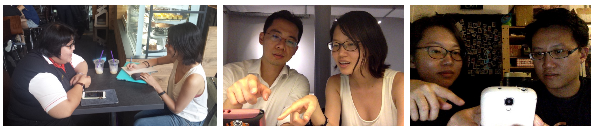
We then came up with a set of questions and interviewed 9 starhub users to understand some scenerios where they use the app.
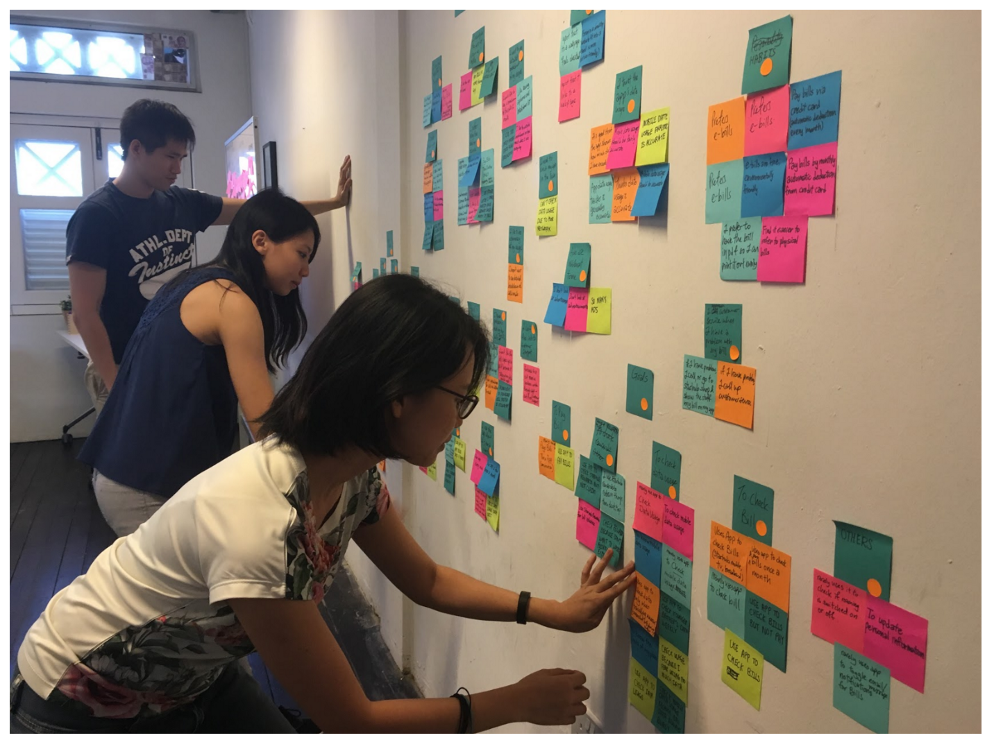
We consolidated our findings by grouping their needs and pain points in an affinity map.
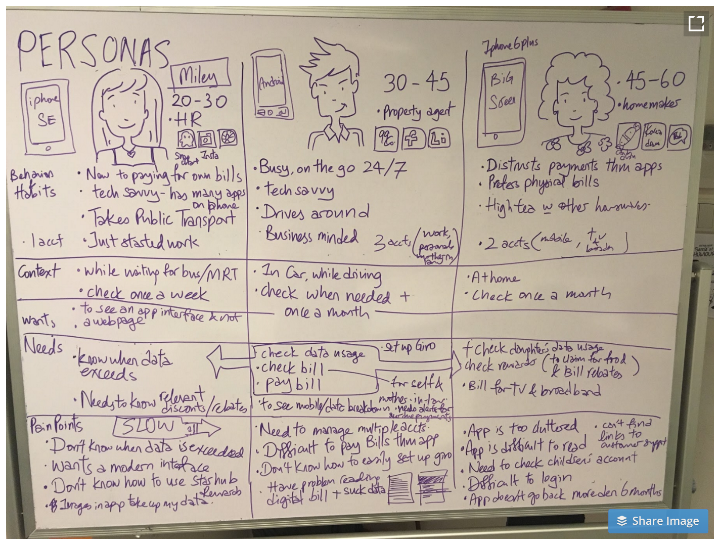
Based on the map, we came up with three personas who are likely to use the app, as well as the scenerios they tend to use them in.
Insights:
Persona 1:
Miley, 25, a millenial, frequently uses snapchat, instagram, and tumblr to keep up with her friend's lives on-the-go.
Key Pain Points:
- Current Starhub app is slow and laggy
- Needs to know when she exceeds her data limit
Persona 2:
Aaron, 37, a successful businessman, has multiple phone lines and is often busy. He needs to easily check bills for all accounts and pay bills quickly while travelling from place to place.
Key Pain Points:
- Having to key in credit card number for every payment
- Difficult to view and choose which Starhub account to pay for
- Forced to download PDF bill to view breakdown of bill
- Lacking information to set up GIRO
Persona 3:
Mui Choon, 52, a homemaker, likes to save money by redeeming bill rebates via My Rewards page. She also has to
Key Pain Points:
- Font size throughout app is difficult to read
- Login is confusing
- Frustrated that My Rewards section loads a webpage that is difficult to read
- Reward points system is confusing, not sure when points expire.
Feature Prioritization
-coming soon-
Lo-fi Prototype (Sketch, Invision)
-coming soon-
Usability Testing
-coming soon-
Insights
-coming soon-
Solutions
I updated the app design so that it is similar to the style of the current starhub website.
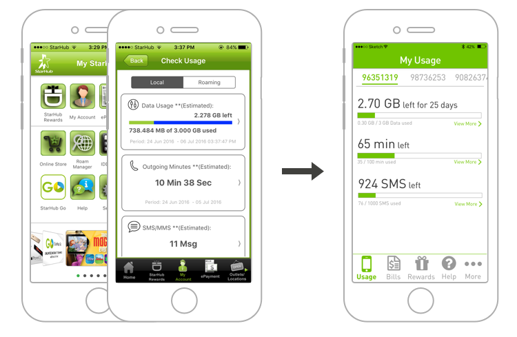
Check Data Usage
Our new design allows our persona, Miley to check her data usage immediately after login.
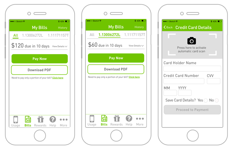
Pay Bills
Aaron can also easily toggle to view his bills due across different accounts, and can save his credit card number within the app.
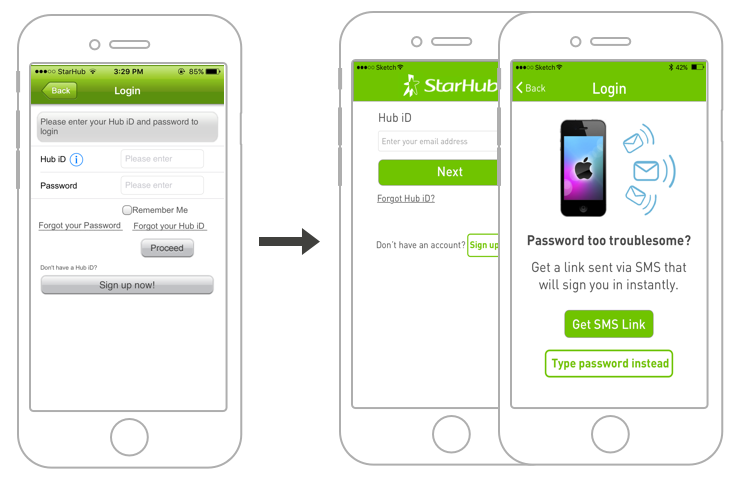
Simple Login
Mui Choon can use an sms link to get her password if she forgets it.
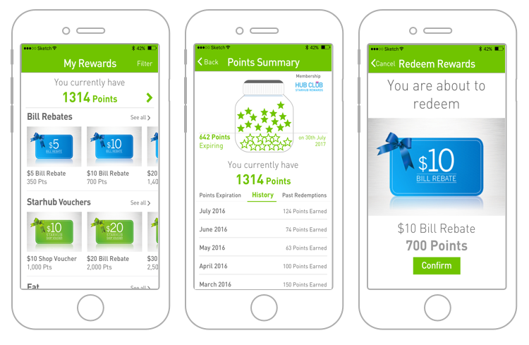
Browse Rewards
She can also see a clear breakdown of her reward points and browse comfortably in a app interface with bigger fonts.
Interactive Prototype
Learn More
Video Walkthrough from Persona's POV
Presentation Slides
Read More